Silence=Death: A Case Study in Graphic Design for Social Change
Introduction
The Silence=Death poster, created by the SILENCE=DEATH Project and later adopted by the Aids Coalition to Unleash Power (ACT UP) in 1987, is a powerful and enduring symbol of the AIDS crisis. The poster is an example of how clear and concise visual language can be used to carry messages with great depth. The text of the poster also demonstrates the power of language and slogans in calling viewers to action. The poster also excels at not just raising awareness and creating thought, but moving people towards tangible political action.

SILENCE=DEATH, ACT UP
Historical Context
The Silence=Death poster emerged during a period of profound government neglect regarding AIDS. By the late 1980s, AIDS had claimed the lives of thousands, but there was a lack of meaningful response from the United States government, public health organizations, media, and other political and cultural institutions. Stigma against queer individuals fueled this apathy, rendering the epidemic unresponded to by people outside the communities most affected.
The Aids Coalition to Unleash Power, or ACT UP, was formed in 1987 in response to the widespread apathy during the AIDS crisis. The group used a public approach with strategies of public demonstrations, media engagement, and public poster graphic design to demand accountability from institutions, create community, and inspire direct action. The Silence=Death poster reframes silence as an ethical failing. Inaction was a matter of life or death.
Visual Analysis
The poster’s dominant element is a pink triangle, referencing the color-coded badges that marked people deemed gay or trans-feminine by Nazis and placed in concentration camps. During the gay liberation movement of the 70s, the pink triangle became a reclaimed symbol of the queer community as a whole. The reappropriation of a hate symbol as a symbol of community challenges ideas of power and victimhood. The use of this symbol in the poster also draws attention to the issues of systemic oppression that allowed AIDS to proliferate.
The encompassing, black background allows the composition to visually breathe and sit in silence. The simplified palette of black, white, and pink creates a monumental identity, reminding viewers of the defined color palettes of governments or institutions. Using the colors of white on black allow the eye to be first drawn to the text first as the point of highest contrast. The pink midtone becomes a softer, gentler element. The stark contrast of the poster serves goals of legibility, memorability, reproducibility, and conveying urgency.
The poster’s subdominant element is its large text in white, saying “Silence = Death.” Smaller text at the bottom reads, “Why is Reagan silent about AIDS? What is really going on at the Center for Disease Control, the Federal Drug Administration, and the Vatican? Gays and lesbians are not expendable… Use your power… Vote… Boycott… Defend yourselves… Turn anger, fear, grief into action.” The message references two types of silence to convey layered meanings. The inaction of federal and cultural institutions are condemned and deemed deadly. The text also acts as a call to individual and communal action, inviting the viewer to break their own silence and use their own power to create change.
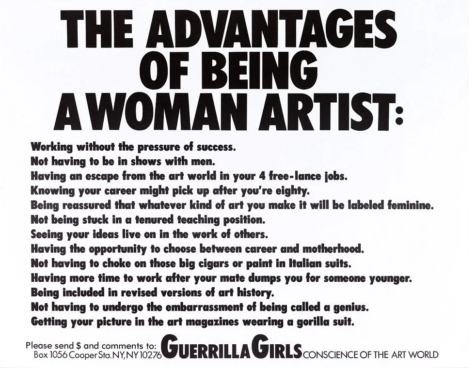
The center-aligned text and triangle create a stability and lack of visual motion that serves the message of silence or death. The boldness, high x-height, high leading, and sans-serif quality of the type serve a functional purpose of clear legibility as well as conveying power and depth. The typography also acts in reference to other revolutionary art, echoing type choices used by the Guerilla Girls, as well as the enduring “I AM A MAN” posters of the Memphis Sanitation Workers Strike.

SILENCE=DEATH, ACT UP
The Advantages of Being a Woman Artist, Guerrilla Girls
Conclusion
The enduring legacy of the Silence=Death poster lies in its ability to bridge design and activism, demonstrating how design can powerfully distill complex social and political messaging into a compelling visual and textual statement. The poster’s success underscores the importance of visibility, legibility, and clear messaging in social movements. For political movements to gain ground, they need to be able to communicate effectively.
The poster also acknowledges the limits of symbolic action. It does not just exist to raise awareness or create thought, but to push people towards direct action. Much social art fails at creating this momentum, either through lack of efficient messaging or lack of efficient call to action. The poster’s message of, “Use your power… Vote… Boycott… Defend yourselves… Turn anger, fear, grief into action” is directly applicable to many causes and still relevant to people across time.
Sources:
“Living as Form.” n.d. Creativetime.org. https://creativetime.org/programs/archive/2011/livingasform/archive.htm.
“SILENCE=DEATH.” 2017. Brooklyn Museum. 2017. https://www.brooklynmuseum.org/objects/159258.